起動方法
gnuplot
コマンドで
$ gnuplot
とすれば起動できる。
初期設定ファイルは gnuplotrc にある。
gnuplotrc の場所の見つけ方(macの場合)
https://yanagibrow.hateblo.jp/entry/20130101/1357030013
matplotlib
python ファイル(hogehoge.pyのような名前のファイル)を作る。
(import matplotlib を .py ファイルにインポートしておく。)
プロット内容を hogehoge.py の中に記述する。
python ファイルを実行する。実行方法は
$ python3 hogehoge.py
python は、python3 と python2 があって、print() 関数の書き方などが違っている。
以下では python3 で記述。
散布図(グラフ)の作成
gnuplot
w p または with points で、点プロットができる。
using を使ってプロットしたい列を指定できる。
plot "data.dat" using 2:1 w p
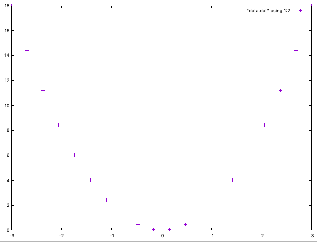
data.dat はデータが入ったテキストファイル。
matplotlib
matplotlib を通例、plt という名前でインポートしてグラフを作成する。
plt.show() でグラフを表示する。
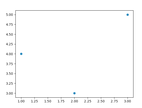
scatter=散布図
import matplotlib.pyplot as plt

x = [1,2,3]
y = [4,3,5]

plt.scatter(x, y)
plt.show()
plt.scatter のかわりに
ax.scatter
を使っても良い。以下は、ax を使う方法。
import matplotlib.pyplot as plt
fig, ax = plt.subplots()

x = [1,2,3]
y = [4,3,5]

ax.scatter(x, y)
plt.show()

プロット点のサイズを変更する
gnuplot
gnuplot > plot "data.dat" ps 10
matplotlib
markersize を次のコマンドで変更する
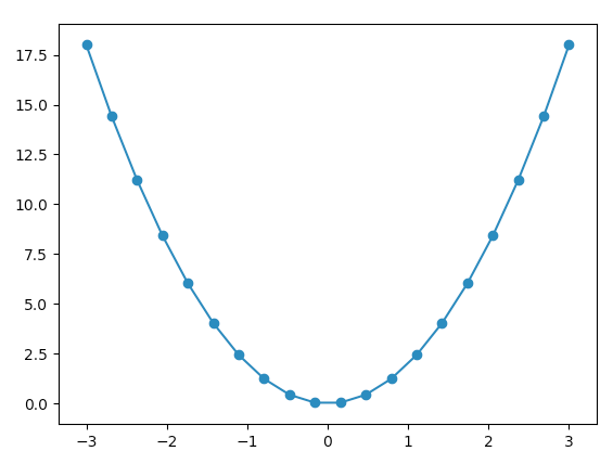
ax.plot(x,y, marker='o', markersize=20)
プロット点のサイズ変更ができる。
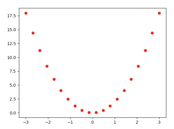
import matplotlib.pyplot as pltimport numpy as np
x = np.linspace(-3,3, 20)y = 2 * x ** 2
fig, ax = plt.subplots()ax.plot(x,y, marker='o', markersize=20)
# プロットを画面に表示する
plt.show()
点の色を変更する
gnuplot
lt (数字)または lt rgb ‘(色の名前を指定)’ で、線の色を変更できる。
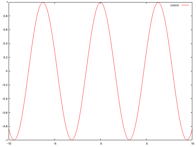
gnuplot > plot cos(x) lt -1 # 黒色
# 他の色にする方法
gnuplot > plot sin(x) lc rgb 'gold' # 金色
gnuplot > plot cos(x) lc rgb "red" # 赤色
または
gnuplot> set style line 2 lt rgb "red"
gnuplot> plot sin(x) ls 2
matplotlib
import matplotlib.pyplot as plt
import numpy as np

fig, ax = plt.subplots()

x = np.linspace(-3,3, 20)
y = 2 * x ** 2

ax.scatter(x, y, color="#ee0000")
plt.show()
ファイルからデータを読み込み
gnuplot
plot(“data.dat”) でファイルの相対パスを指定する
gnuplot > plot "data.dat"
matplotlib
file open を使う
import matplotlib.pyplot as plt

with open("data.txt") as f:
    data = f.read()
    data = data.split('\n')

    x = [float(row.split(' ')[0]) for row in data]
    y = [float(row.split(' ')[1]) for row in data]

    fig, ax = plt.subplots()
    ax.plot(x,y, marker='o', markersize=5)

    # プロットを画面に表示する
    plt.show()
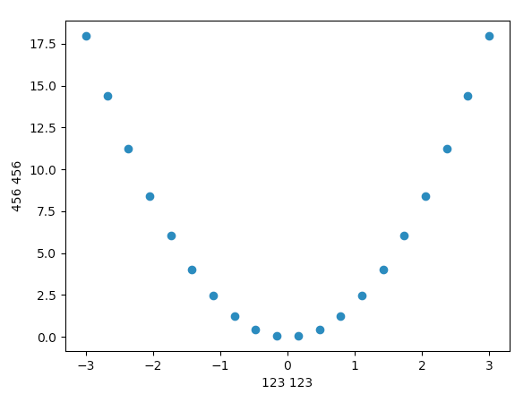
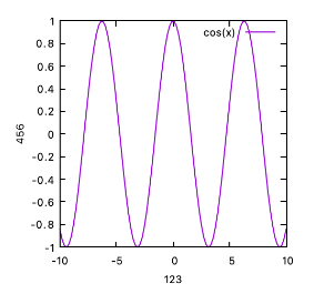
x軸、y軸にラベルをつける
gnuplot
gnuplot > set xlabel "123 123"
gnuplot > set ylabel "456 456"
gnuplot > plot x*x
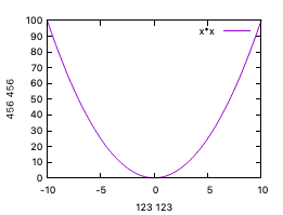
matplotlib
set_xlabel と set_ylabel を使う。
import matplotlib.pyplot as plt
import numpy as np

fig, ax = plt.subplots()

x = np.linspace(-3,3, 20)
y = 2 * x ** 2

ax.set_xlabel("123 123")
ax.set_ylabel("456 456")

ax.scatter(x, y)
plt.show()
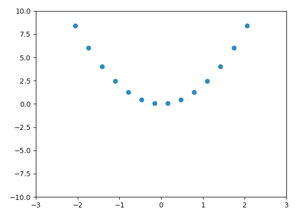
x軸、y軸の描画範囲を変更する
gnuplot
xrange, yrange を設定する。
gnuplot > set xrange [-3:3]
gnuplot > set yrange [-3:3]
gnuplot > replot
matplotlib
set_xlim と set_ylim を使う。
import matplotlib.pyplot as plt
import numpy as np

fig, ax = plt.subplots()

x = np.linspace(-3,3, 20)
y = 2 * x ** 2

ax.set_xlim(-3,3)
ax.set_ylim(-10,10)

ax.scatter(x, y)
plt.show()
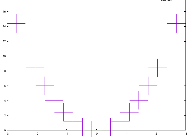
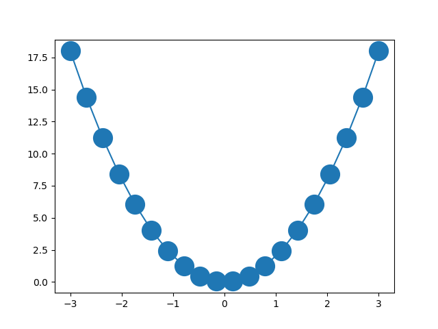
点つき線でプロットする
gnuplot
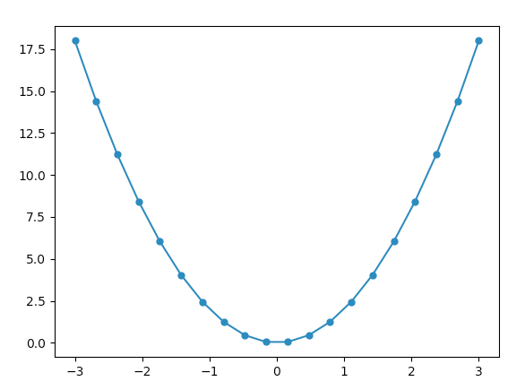
with linespoints または w lp で点付き線を使ったプロットができる。
gnuplot > plot 1:2 with linespoints
matplotlib
marker=’o’ を設定する。
import matplotlib.pyplot as plt
import numpy as np

fig, ax = plt.subplots()

x = np.linspace(-3,3, 20)
y = 2 * x ** 2

ax.plot(x,y, marker='o', markersize=5)

ax.scatter(x, y)
plt.show()
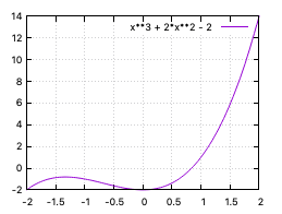
他に、line2d をインポートして使う方法がある。次のように、ax.add_line で線を追加する。
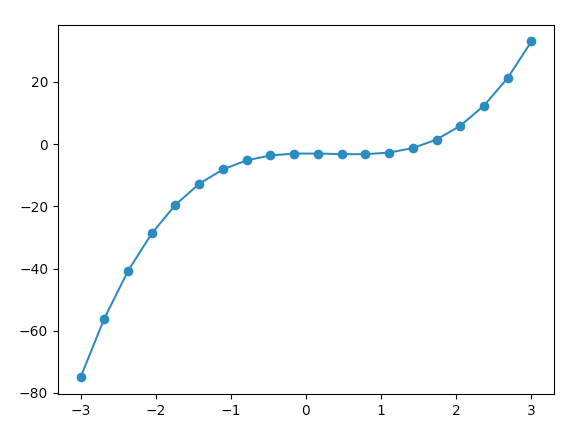
from matplotlib.lines import Line2D
import matplotlib.pyplot as plt
import numpy as np

x = np.linspace(-3,3, 20)
y = 2 * x ** 3 - 2 * x ** 2 - 3

line = Line2D(x, y)
fig, ax = plt.subplots()
ax.scatter(x,y)
ax.add_line(line)

# プロットを画面に表示する
plt.show()
サブプロット(複数のグラフをプロットする)
gnuplot
サブプロットやったことないので不明。
matplotlib
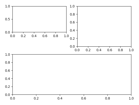
import matplotlib.pyplot as plt
import numpy as np

fig = plt.figure()

ax_1 = fig.add_subplot(3,2,1)
ax_2 = fig.add_subplot(2,2,2)
ax_3 = fig.add_subplot(2,1,2)

plt.show()
画面を適当に分割して、グラフをプロットすることができる。
subplot(縦分割数、横分割数、位置の番号)という順番に数値を指定する。
位置の番号は、左から右へ、上から下へと移動している。
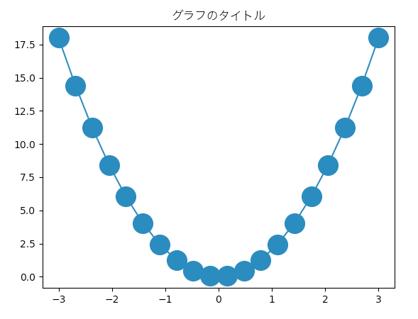
グラフのタイトルを設定する。
gnuplot
set title "グラフのタイトル"
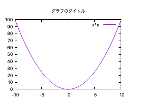
matplotlib
import matplotlib.pyplot as plt
import numpy as np

x = np.linspace(-3,3, 20)
y = 2 * x ** 2

fig, ax = plt.subplots()
ax.plot(x,y, marker='o', markersize=20)

plt.title('グラフのタイトル',fontname="Hiragino Sans")
# プロットを画面に表示する
plt.show()
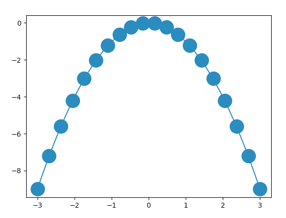
データ点の値に対して、関数を適用する。
gnuplot
gnuplot > plot “data.txt” u 1:($2 * $2)
matplotlib
ブロードキャストという仕組みがある。
以下のコードで、-t^2 の関数を各点に適用することができる。
import matplotlib.pyplot as plt
import numpy as np

def func(t):
    return -1 * t * t

x = np.linspace(-3,3, 20)
y = x

fig, ax = plt.subplots()
ax.plot(x,func(x), marker='o', markersize=20)

# プロットを画面に表示する
plt.show()
グラフ内に文(アノテーション)を表示する
gnuplot
gnuplot> set label "123_123 abc" at 0,-10
gnuplot> set xrange [-2:2]
gnuplot> plot x**3 - 2*x**2 - 2
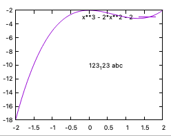
matplotlib
アノテーションをつけるには、
ax.annotate
を使う。(図省略)
軸を対数に設定する
gnuplot
gnuplot > set log x
gnuplot > set log y
matplotlib
ax.set_xscale('log')
ax.set_yscale('log')
縦横の背景に罫線(グリッド)を設定する
gnuplot
# 罫線
gnuplot > set grid x
gnuplot > set grid y

# 補助罫線
gnuplot > set grid mxtics
gnuplot > set grid mytics
matplotlib
plt.grid(True)
import matplotlib.pyplot as plt

# MultipleLocator が見つからない場合は、↓を忘れていないかチェック
from matplotlib.ticker import MultipleLocator

fig, ax = plt.subplots()

# y軸 0.3 ごとに実罫線、0.1 ごとに補助罫線を表示する
ax.yaxis.set_major_locator(MultipleLocator(0.3))
ax.yaxis.set_minor_locator(MultipleLocator(0.1))

plt.grid(True, which="major", linestyle="-")
plt.grid(True, which="minor", linestyle="--")

plt.show()
補助目盛りを表示する方法
目盛りの位置を指定する。
「罫線」「minor tics」などで検索すると、やり方が見つかる場合がある。
gnuplot
gnuplot > set mxtics
gnuplot > set mytics
matplotlib
以下のように、set_major_locator と、set_minor_locator を使って設定する。
import numpy as np
import matplotlib.pyplot as plt

# MultipleLocator が見つからない場合は、↓を忘れていないかチェック
from matplotlib.ticker import MultipleLocator

# 日本語を表示できるようにする
plt.rcParams['font.family'] = 'Hiragino Sans'

fig, ax = plt.subplots()

ax.set_xlim(-3,3)
ax.set_ylim(-1,1)

# x軸 1 ごとに実罫線、0.2 ごとに補助罫線を表示する
ax.xaxis.set_major_locator(MultipleLocator(1.0))
ax.xaxis.set_minor_locator(MultipleLocator(0.2))

# y軸 0.3 ごとに実罫線、0.1 ごとに補助罫線を表示する
ax.yaxis.set_major_locator(MultipleLocator(0.3))
ax.yaxis.set_minor_locator(MultipleLocator(0.1))

plt.grid(True, which="major", linestyle="-")
plt.grid(True, which="minor", linestyle="--")
plt.show()
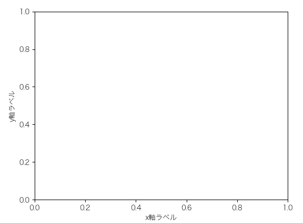
x, y 軸にラベルを設定する
gnuplot では、set xlabel や set ylabel を使って設定できる。
gnuplot > set xlabel "123"
gnuplot > set ylabel "456"
gnuplot > plot cos(x)
import numpy as np
import matplotlib.pyplot as plt

# 日本語を表示できるようにする
plt.rcParams['font.family'] = 'Hiragino Sans'

fig, ax = plt.subplots()
ax.set_xlabel('x軸ラベル')
ax.set_ylabel('y軸ラベル')
plt.show()
latex 記法を使った数式をタイトルやラベルに表示する方法
gnuplot
グラフを eps ファイルで出力し、tex ファイルに埋め込みたい場合
gnuplot の出力先を eps とする。 set term で epslatex を設定する。
ギリシャ文字などを入力する方法は次のリンクの記事を参照。
matplotlib
plt.rcParams[‘text.usetex’] = Trueという行を入れることによって、タイトルやテキストで tex 記号が使えるようになる。
import matplotlib.pyplot as plt

# tex 記法を使えるようにする
plt.rcParams['text.usetex'] = True

fig, ax = plt.subplots()

ax.set_title(r'$f(x) = \sin ^2 (x)$')
ax.text(0.5,0.7,r'\TeX\ $\frac{2}{x^2 + a^2}$')

plt.show()
プロット手順を記述したファイルを保存する
gnuplot
gnuplot コマンドを入力して、保存する。
gnuplot > save "savefile.plt"
拡張子は .plt が使われることが多いような気がする。
matplotlib
python ファイルとして、”.py” の拡張子ファイルとして保存する。
プロット手順を記述したファイルを読み込む方法
gnuplot
gnuplot > load "savefile.plt"
matplotlib
通常の python スクリプトを実行するのと同じやり方でファイルを読み込む(ロード)できる。
python savefile.py
python3 の場合には
python3 savefile.py

![[商品価格に関しましては、リンクが作成された時点と現時点で情報が変更されている場合がございます。]](https://hbb.afl.rakuten.co.jp/hgb/2ae66f5e.1c6eabdc.2ae66f5f.baa0ec1d/?me_id=1339082&item_id=10089082&pc=https%3A%2F%2Fthumbnail.image.rakuten.co.jp%2F%400_mall%2Fitunes%2Fcabinet%2Fmem_item%2Fimgrc0090874582.jpg%3F_ex%3D240x240&s=240x240&t=picttext "[商品価格に関しましては、リンクが作成された時点と現時点で情報が変更されている場合がございます。]")

![[商品価格に関しましては、リンクが作成された時点と現時点で情報が変更されている場合がございます。]](https://hbb.afl.rakuten.co.jp/hgb/38943163.9ed7feb6.38943164.feb189f1/?me_id=1370968&item_id=10199606&pc=https%3A%2F%2Fthumbnail.image.rakuten.co.jp%2F%400_mall%2Fgpgiftcard%2Fcabinet%2Fnewcrad.jpg%3F_ex%3D240x240&s=240x240&t=picttext "[商品価格に関しましては、リンクが作成された時点と現時点で情報が変更されている場合がございます。]")
![[商品価格に関しましては、リンクが作成された時点と現時点で情報が変更されている場合がございます。]](https://hbb.afl.rakuten.co.jp/hgb/1e4f62be.725c8a0a.1e4f62bf.82312a17/?me_id=1269553&item_id=13798775&pc=https%3A%2F%2Fthumbnail.image.rakuten.co.jp%2F%400_mall%2Fbiccamera%2Fcabinet%2Fproduct%2F7134%2F00000010267425_a01.jpg%3F_ex%3D100x100&s=100x100&t=picttext "[商品価格に関しましては、リンクが作成された時点と現時点で情報が変更されている場合がございます。]")
![[商品価格に関しましては、リンクが作成された時点と現時点で情報が変更されている場合がございます。]](https://hbb.afl.rakuten.co.jp/hgb/1e4f62be.725c8a0a.1e4f62bf.82312a17/?me_id=1269553&item_id=12697495&pc=https%3A%2F%2Fthumbnail.image.rakuten.co.jp%2F%400_mall%2Fbiccamera%2Fcabinet%2Fproduct%2F4694%2F00000007127888_a01.jpg%3F_ex%3D100x100&s=100x100&t=picttext "[商品価格に関しましては、リンクが作成された時点と現時点で情報が変更されている場合がございます。]")
![[商品価格に関しましては、リンクが作成された時点と現時点で情報が変更されている場合がございます。]](https://hbb.afl.rakuten.co.jp/hgb/2124eef8.f98c36bb.2124eef9.b64e560c/?me_id=1357621&item_id=10581058&pc=https%3A%2F%2Fthumbnail.image.rakuten.co.jp%2F%400_mall%2Fyamada-denki%2Fcabinet%2Fa07000292%2F6892433018.jpg%3F_ex%3D100x100&s=100x100&t=picttext "[商品価格に関しましては、リンクが作成された時点と現時点で情報が変更されている場合がございます。]")
![[商品価格に関しましては、リンクが作成された時点と現時点で情報が変更されている場合がございます。]](https://hbb.afl.rakuten.co.jp/hgb/38943afe.b4232a1b.38943aff.3dfb7d7d/?me_id=1278318&item_id=10000451&pc=https%3A%2F%2Fthumbnail.image.rakuten.co.jp%2F%400_mall%2Firobotstore%2Fcabinet%2Fitem_thum%2Fbr_thum%2Fj9p_tm.jpg%3F_ex%3D100x100&s=100x100&t=picttext "[商品価格に関しましては、リンクが作成された時点と現時点で情報が変更されている場合がございます。]")
