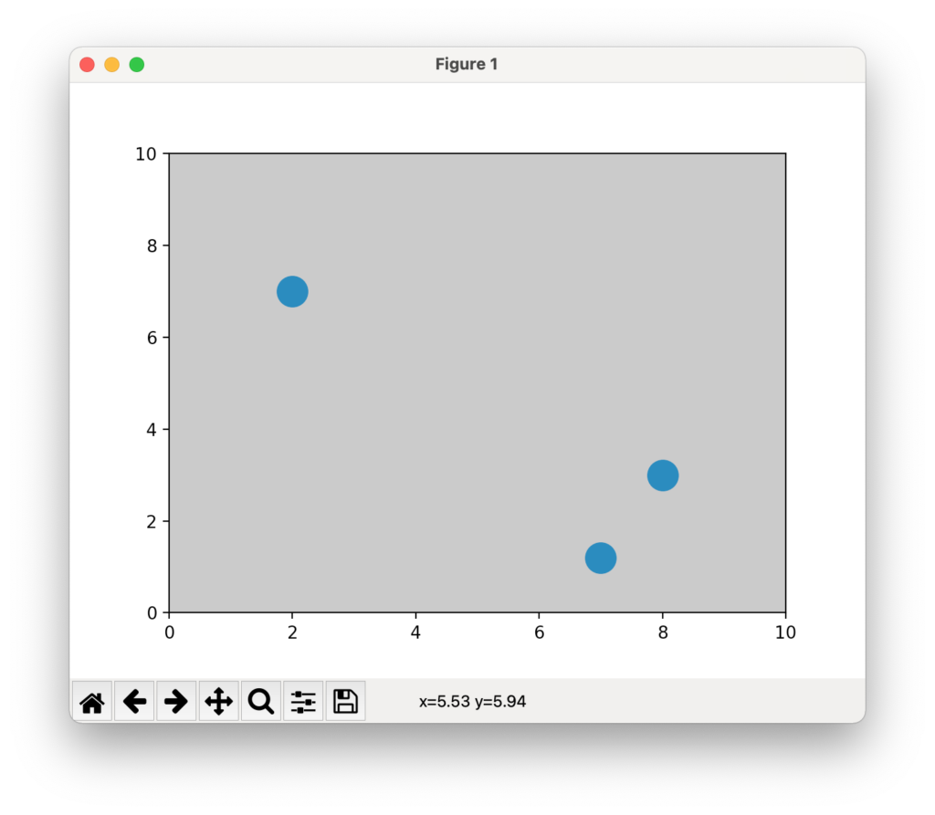
次のように、axes で facecolor を変更すればよい。
例
from matplotlib import pyplot as plt

x = [2,7,8]
y = [7,1.2,3]

fig, ax = plt.subplots()
size = 300
ax.scatter(x,y,size)
ax.set_xlim([0,10])
ax.set_ylim([0,10])
ax.set_facecolor('silver')
plt.show()
結果
雑記
投稿日:
次のように、axes で facecolor を変更すればよい。
from matplotlib import pyplot as plt
x = [2,7,8]
y = [7,1.2,3]
fig, ax = plt.subplots()
size = 300
ax.scatter(x,y,size)
ax.set_xlim([0,10])
ax.set_ylim([0,10])
ax.set_facecolor('silver')
plt.show()執筆者:seyanen
関連記事

破線をカスタマイズする方法 以下では、dashes = [5,2,2,2] で、線5・空白2・線2・空白2の破線を指定している。 詳しくは次を参照。 https://matplotlib.org/st …
matplotlib でcsv ファイルを読み込むとき、最初の行をスキップする方法
numpy の loadtxt で読み込む行を省略したい場合 スキップしたい行を # 等の記号でコメントアウトして、 loadtxt の comments = ‘#’ とすると …
2次関数のグラフを表示するには次のようにする。 例 import matplotlib.pyplot as plt import numpy as np # numpy linspace 等間隔な数列 …
items() で辞書から要素を取り出し、random.choice でランダムに要素を選択する。 例 import random # 県庁所在地 mydict = {‘宮城県’:’仙台市’,’茨城県 …
python におけるシフト演算子(<< と >> )の使い方
32 = 2^5 なので、 << 1 とすると数値は2倍され、 >> 1 とすると数値が2分の1となる。 例 print(32 << 0) print(32 << …
スポンサーリンク
2024/01/09

2023/01/18
matplotlib のグラフ作成と gnuplot との対応 比較
2022/10/14
pythonで配列(リスト)の、ある要素がわかっているときにその次の要素を取得する方法。
2022/10/09
2022/09/05
![[商品価格に関しましては、リンクが作成された時点と現時点で情報が変更されている場合がございます。]](https://hbb.afl.rakuten.co.jp/hgb/2ae66f5e.1c6eabdc.2ae66f5f.baa0ec1d/?me_id=1339082&item_id=10089082&pc=https%3A%2F%2Fthumbnail.image.rakuten.co.jp%2F%400_mall%2Fitunes%2Fcabinet%2Fmem_item%2Fimgrc0090874582.jpg%3F_ex%3D240x240&s=240x240&t=picttext "[商品価格に関しましては、リンクが作成された時点と現時点で情報が変更されている場合がございます。]")

![[商品価格に関しましては、リンクが作成された時点と現時点で情報が変更されている場合がございます。]](https://hbb.afl.rakuten.co.jp/hgb/38943163.9ed7feb6.38943164.feb189f1/?me_id=1370968&item_id=10199606&pc=https%3A%2F%2Fthumbnail.image.rakuten.co.jp%2F%400_mall%2Fgpgiftcard%2Fcabinet%2Fnewcrad.jpg%3F_ex%3D240x240&s=240x240&t=picttext "[商品価格に関しましては、リンクが作成された時点と現時点で情報が変更されている場合がございます。]")
![[商品価格に関しましては、リンクが作成された時点と現時点で情報が変更されている場合がございます。]](https://hbb.afl.rakuten.co.jp/hgb/1e4f62be.725c8a0a.1e4f62bf.82312a17/?me_id=1269553&item_id=13798775&pc=https%3A%2F%2Fthumbnail.image.rakuten.co.jp%2F%400_mall%2Fbiccamera%2Fcabinet%2Fproduct%2F7134%2F00000010267425_a01.jpg%3F_ex%3D100x100&s=100x100&t=picttext "[商品価格に関しましては、リンクが作成された時点と現時点で情報が変更されている場合がございます。]")
![[商品価格に関しましては、リンクが作成された時点と現時点で情報が変更されている場合がございます。]](https://hbb.afl.rakuten.co.jp/hgb/1e4f62be.725c8a0a.1e4f62bf.82312a17/?me_id=1269553&item_id=12697495&pc=https%3A%2F%2Fthumbnail.image.rakuten.co.jp%2F%400_mall%2Fbiccamera%2Fcabinet%2Fproduct%2F4694%2F00000007127888_a01.jpg%3F_ex%3D100x100&s=100x100&t=picttext "[商品価格に関しましては、リンクが作成された時点と現時点で情報が変更されている場合がございます。]")
![[商品価格に関しましては、リンクが作成された時点と現時点で情報が変更されている場合がございます。]](https://hbb.afl.rakuten.co.jp/hgb/2124eef8.f98c36bb.2124eef9.b64e560c/?me_id=1357621&item_id=10581058&pc=https%3A%2F%2Fthumbnail.image.rakuten.co.jp%2F%400_mall%2Fyamada-denki%2Fcabinet%2Fa07000292%2F6892433018.jpg%3F_ex%3D100x100&s=100x100&t=picttext "[商品価格に関しましては、リンクが作成された時点と現時点で情報が変更されている場合がございます。]")
![[商品価格に関しましては、リンクが作成された時点と現時点で情報が変更されている場合がございます。]](https://hbb.afl.rakuten.co.jp/hgb/38943afe.b4232a1b.38943aff.3dfb7d7d/?me_id=1278318&item_id=10000451&pc=https%3A%2F%2Fthumbnail.image.rakuten.co.jp%2F%400_mall%2Firobotstore%2Fcabinet%2Fitem_thum%2Fbr_thum%2Fj9p_tm.jpg%3F_ex%3D100x100&s=100x100&t=picttext "[商品価格に関しましては、リンクが作成された時点と現時点で情報が変更されている場合がございます。]")