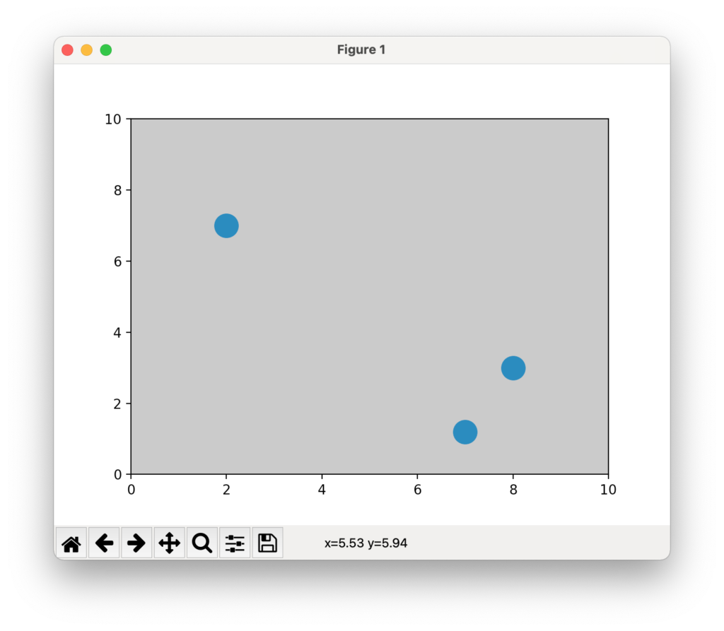
次のように、axes で facecolor を変更すればよい。
例
from matplotlib import pyplot as plt

x = [2,7,8]
y = [7,1.2,3]

fig, ax = plt.subplots()
size = 300
ax.scatter(x,y,size)
ax.set_xlim([0,10])
ax.set_ylim([0,10])
ax.set_facecolor('silver')
plt.show()
結果
雑記
投稿日:
次のように、axes で facecolor を変更すればよい。
from matplotlib import pyplot as plt
x = [2,7,8]
y = [7,1.2,3]
fig, ax = plt.subplots()
size = 300
ax.scatter(x,y,size)
ax.set_xlim([0,10])
ax.set_ylim([0,10])
ax.set_facecolor('silver')
plt.show()執筆者:seyanen
関連記事

matplotlib で、x軸・y軸の目盛りを反対方向につけたい場合。
デフォルトでは、x軸はグラフの下に、y軸は左側につけられる。 例 import numpy as np from matplotlib import pyplot as plt x = np.lins …
2次関数のグラフを表示するには次のようにする。 例 import matplotlib.pyplot as plt import numpy as np # numpy linspace 等間隔な数列 …
keys()メソッドでは、キー一覧を取得できる。values() では、値を取得できる。items() では、キーと値をタプルとして取得できる。 リストに変換すると、print() でコンソールに表示 …
python3 で、csv ファイルの日付・数字を読み取る方法
csv をインポートすると、row in reader はリストになっている。 次のようにして、各行の要素を取り出して表示することができる。 例 import csv with open(‘data. …

matplotlib のグラフ作成と gnuplot との対応 比較
起動方法 gnuplot コマンドで $ gnuplot とすれば起動できる。 初期設定ファイルは gnuplotrc にある。 gnuplotrc の場所の見つけ方(macの場合) https:// …
スポンサーリンク
2024/01/09
2023/01/18
matplotlib のグラフ作成と gnuplot との対応 比較
2022/10/14
pythonで配列(リスト)の、ある要素がわかっているときにその次の要素を取得する方法。
2022/10/09
2022/09/05
![[商品価格に関しましては、リンクが作成された時点と現時点で情報が変更されている場合がございます。]](https://hbb.afl.rakuten.co.jp/hgb/2ae66f5e.1c6eabdc.2ae66f5f.baa0ec1d/?me_id=1339082&item_id=10089082&pc=https%3A%2F%2Fthumbnail.image.rakuten.co.jp%2F%400_mall%2Fitunes%2Fcabinet%2Fmem_item%2Fimgrc0090874582.jpg%3F_ex%3D240x240&s=240x240&t=picttext "[商品価格に関しましては、リンクが作成された時点と現時点で情報が変更されている場合がございます。]")

![[商品価格に関しましては、リンクが作成された時点と現時点で情報が変更されている場合がございます。]](https://hbb.afl.rakuten.co.jp/hgb/38943163.9ed7feb6.38943164.feb189f1/?me_id=1370968&item_id=10199606&pc=https%3A%2F%2Fthumbnail.image.rakuten.co.jp%2F%400_mall%2Fgpgiftcard%2Fcabinet%2Fnewcrad.jpg%3F_ex%3D240x240&s=240x240&t=picttext "[商品価格に関しましては、リンクが作成された時点と現時点で情報が変更されている場合がございます。]")
![[商品価格に関しましては、リンクが作成された時点と現時点で情報が変更されている場合がございます。]](https://hbb.afl.rakuten.co.jp/hgb/1e4f62be.725c8a0a.1e4f62bf.82312a17/?me_id=1269553&item_id=13798775&pc=https%3A%2F%2Fthumbnail.image.rakuten.co.jp%2F%400_mall%2Fbiccamera%2Fcabinet%2Fproduct%2F7134%2F00000010267425_a01.jpg%3F_ex%3D100x100&s=100x100&t=picttext "[商品価格に関しましては、リンクが作成された時点と現時点で情報が変更されている場合がございます。]")
![[商品価格に関しましては、リンクが作成された時点と現時点で情報が変更されている場合がございます。]](https://hbb.afl.rakuten.co.jp/hgb/1e4f62be.725c8a0a.1e4f62bf.82312a17/?me_id=1269553&item_id=12697495&pc=https%3A%2F%2Fthumbnail.image.rakuten.co.jp%2F%400_mall%2Fbiccamera%2Fcabinet%2Fproduct%2F4694%2F00000007127888_a01.jpg%3F_ex%3D100x100&s=100x100&t=picttext "[商品価格に関しましては、リンクが作成された時点と現時点で情報が変更されている場合がございます。]")
![[商品価格に関しましては、リンクが作成された時点と現時点で情報が変更されている場合がございます。]](https://hbb.afl.rakuten.co.jp/hgb/2124eef8.f98c36bb.2124eef9.b64e560c/?me_id=1357621&item_id=10581058&pc=https%3A%2F%2Fthumbnail.image.rakuten.co.jp%2F%400_mall%2Fyamada-denki%2Fcabinet%2Fa07000292%2F6892433018.jpg%3F_ex%3D100x100&s=100x100&t=picttext "[商品価格に関しましては、リンクが作成された時点と現時点で情報が変更されている場合がございます。]")
![[商品価格に関しましては、リンクが作成された時点と現時点で情報が変更されている場合がございます。]](https://hbb.afl.rakuten.co.jp/hgb/38943afe.b4232a1b.38943aff.3dfb7d7d/?me_id=1278318&item_id=10000451&pc=https%3A%2F%2Fthumbnail.image.rakuten.co.jp%2F%400_mall%2Firobotstore%2Fcabinet%2Fitem_thum%2Fbr_thum%2Fj9p_tm.jpg%3F_ex%3D100x100&s=100x100&t=picttext "[商品価格に関しましては、リンクが作成された時点と現時点で情報が変更されている場合がございます。]")